It takes time, effort and money to get people to your Motivated Seller Website, so make sure you are doing EVERYTHING to convert those site visitors!
This is the first of two articles which covers another aspect of property marketing. I’m going to give you an insight into the perfect motivated seller site, yes these are the sites that enable us to capture motivated seller leads. It’s split in two because there’s quite a lot to go through, and I will put a link to part two at the bottom of this article.
The Motivated Seller Website
A Motivated Seller Site can be seen as a secondary site to your main property investment business website, but it’s an important site to have up and ready to pull in leads to real below market value deals in your area.
Once up, you can have the web address on things like business cards, you can create social posts on purchasing local property at speed and get a leaflet distribution campaign underway with your new motivated seller site front and centre on the leaflet.
You could also step it up a gear and get some geo targeted ads on social sites like Facebook, or some Google ads.
These are all proven ways to find motivated sellers, but now you don’t want to waste that money and effort on an online presence that doesn't convert these hard earned site visitors into leads and of course deals.

How To Create KILLER Property Websites
High converting property websites are the Holy Grail for property investors. Your website says EVERYTHING about you and the property business you want to build.. This FREE Guide explains everything you need to create your high converting property websites!
The Competitive Edge
You would have seen those ‘we buy your property fast’ sites online. Some are great, high converting and run by very reputable businesses or individuals who put a lot of money into online ads, drive a lot of motivated sellers to their sites and have worked on those sites to make sure they convert the most site visitors into leads.
There are others that are really quite poor, they aren't professional looking and consequently get a very low conversion rate.
Get this site right and you will attract and convert more visitors into leads and deals which is why I wanted to get these articles together, along with my podcast in order to look at both the technology aspects of the site, and the psychology of the site such as the on page written copy as well as the layout.
Now the process I’m going to go through here is tried and tested over years. It’s not a rigid formula, more like guidelines and common sense, but following this will make the landing page motivated sellers find themselves on, more appealing and convert more site visitors into leads and consequently conversations, which is what it’s all about.
The Motivated Seller Site Layout
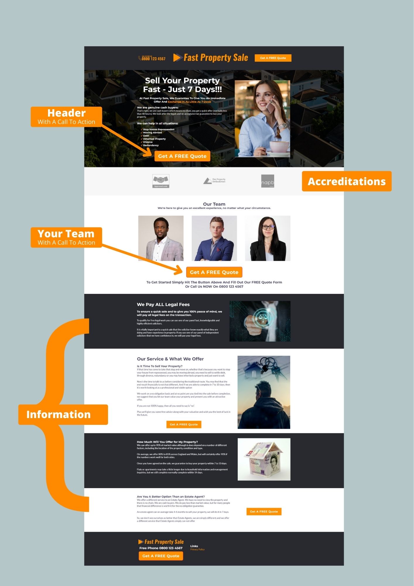
Click To Enlarge This Grapgic
So let’s start with the layout and I’ll link that up with the reasoning and psychology as we go. I also have an accompanying downloadable pdf that goes with this article (which can be found here).
In the pdf I break it all down and go through the different sections of the site..
So whatever method you’re using to get people to the site, whether that’s leaflets, geo targeted social media ads like Facebook, Google, YouTube or other local marketing ideas, at some point the person that’s interested in looking at getting a quick sale on their property is going to land on your site.
So let's go through some basic rules that you must follow if you want your site to achieve it's primary purpose which is to convert site visitors into leads!
Motivated Seller Website Rule #1
Rule #1 is don’t send them to a website, websites have too many distractions, they have navigation, sidebars and a whole host of other distractions. I’ll go through what you should be sending them to in a moment,
Motivated Seller Website Rule #2
Rule #2 is don’t have anything on that page which has anything to do with your property investment business. It needs to be split in two, two different clients with a completely different message and focus.
Increasing Your Conversion Rate
Being in the business, and working with property investors, I see the same issues all the time, people have paid money on ads that go through to a webpage that has links to other aspects of their business that can confuse site visitors.
Imagine being a motivated seller whose in a quite desperate situation and looking to sell their property fast, and seeing links to pages about how you source property or how successful you are as a property investor.. It's not the messaging you want motivated sellers to see. It destroys trust immediately, and yet I see it time and time again.
I know this from experience, I worked with a client who I encouraged to create a specific landing page on a new URL (web address) with no navigation and just one call to action which was for the site visitor to enter their details and the details of the property… her conversions went up by 220%..
So let’s look at the motivated seller page from scratch
Firstly, I said as rule #1 don’t send them to a website. So let me explain.
Generally, anything up on line which we could call a web presence can be seen by most as a website, we don’t use websites as such for our clients we use what are called funnels.. For all intents and purposes that look like a website, but website technology and funnel technology is substantially different
The reason we use funnels is because they enable our client to focus on conversion, rather that creating an online brochure, which is really what a website is.
So we would send people from say a geo targeted Facebook ad to a funnel landing page. This landing page is 100% dedicated to just ONE task, it has no navigation and just one call to action. That call to action is to get their details and the property details, what we’d call a lead, and the beginning of a connection with the motivated seller.
Above The Fold
Now I want to give you a bit of terminology that we use and this is all to do with what people see as soon as they hit your landing page whether that’s on their computer at home or more likely nowadays, on their phone.
It's something we call ‘above the fold’. This is a marketing term for the information a site visitor sees as your page loads. Everything they need to know and the call to action should be immediately visible, without scrolling, and this is what we call ‘above the fold’.

The term comes from the newspaper industry, where a newspaper would have all the juicy headlines and photographs on the top of the front page because when they were displayed at a newsagent’s they would have been folded in half and placed in a rack with all the other papers and consequently in competition for your money.
The newspaper with the most eye catching headline and graphic would, or could win someone over and another sale made…
Hence the term above the fold.
In the case of a landing page it simply means everything that the site visitor needs, information, convincing subtext, graphic and call to action is on page immediately, as they open the site, they can then scroll down for more information if they need it but the info above the fold can captivate them and keep them on the page.
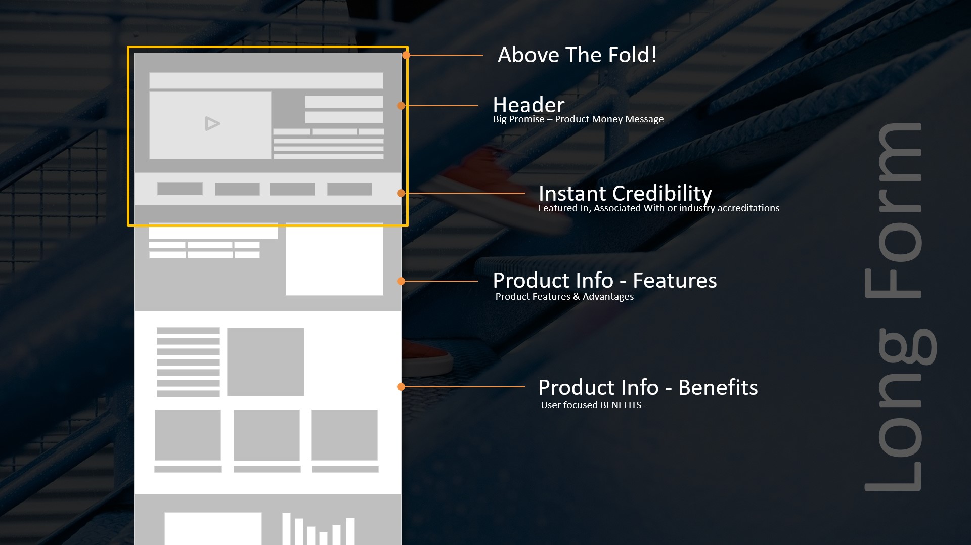
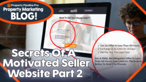
So above the fold you would want an eye-catching headline like ‘We Buy Your Property In 14 Days Or Less’ or ‘Need To Sell Your Property Fast?’
Now these may seem quite crass, and they are, but you have very little time to grab people's attention and the truth is that if someone has reached your page, it’s exactly what they want to see.. It’s confirmed they’re in the right place, which means they stay and read on.
So at the top of the page you need an attention grabbing headline, some supporting, reassuring and attention grabbing information which again makes them stay.
This could be something as simple as 3 bullet points highlighting some tangible benefits for the motivated sellers such as.. Get An Offer In 24 Hours, Exchange In A Little As 7 Days and We Pay ALL Legal Fees..
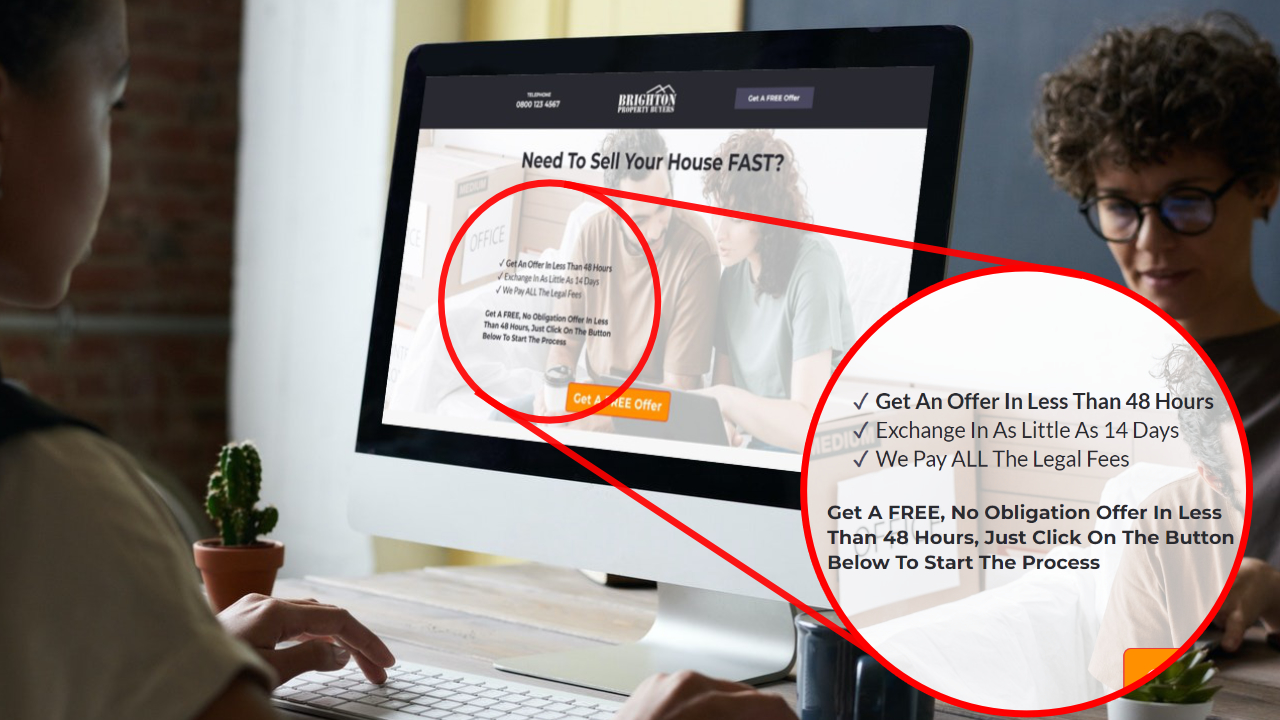
Then just below that have a call to action button which says something like ‘Get A FREE Quote’ or 'Get Your FREE Offer'. This button opens up a form which asks for their details and the details of their property. Lead captured, first and hardest part done.
Once you have captured that lead you need to follow up and that means using a little bit of technology, which I’m going to go through in the next blog article.





[…] This is the second part of a 2 part blog article which looks at the anatomy and technology of a high converting motivated seller website. If you've not see part 1 yet CLICK HERE […]